Activity › Forums › DaVinci Resolve › Old Kodachrome look
-
Old Kodachrome look
Posted by Jim Bachalo on July 27, 2011 at 7:01 pmHi
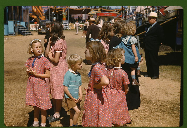
Would love to get some feedback on how to achieve a faded old kodachrome look, like these library of congress photos on flickrhttps://www.flickr.com/photos/library_of_congress/2178246047/in/set-72157603671370361
https://www.flickr.com/photos/library_of_congress/sets/72157603671370361/
Is there a general set of guidelines to follow?
What curve adjustments would you suggest as a starting point?Local is the new global
 Sascha Haber replied 14 years, 9 months ago 8 Members · 12 Replies
 -
12 Replies
-

Robert Houllahan
July 27, 2011 at 7:34 pmWhat is faded about those photos?
Nothing…
they look almost exactly as they did when they were shot.
The single thing you need to know about trying to emulate the Kodachrome look is that it is actually B&W film in three layers with a color (gel) filter for each layer. The actual color (the dyes) were added in the processing.
To attempt to get the Kodachrome look I would start with isolating each color so there is no crosstalk and then punch up the red layer and put a slight curve on the blue. Then add contrast the older Kodachrome stocks were 12ASA and contrasty.
Lastly I would add some soft clipping for each channel as the top end of the Kodachrome has a soft but fast blowout in the hilites.
It will never look like real Kodachrome but you can try…
-Rob-
Robert Houllahan
Director / Colorist
Cinelab Inc.
http://www.cinelab.comMAHC-PRO 6-Core 3X GTX285 20Tb SAS Wave Panel Panny 11UK SDI Plasma.
-

Sascha Haber
July 27, 2011 at 7:37 pmVery good tip, indeed.
And now everyone, lets watch Aviator again and then the Making of.
The film that made me want to become a colorist 🙂A slice of color…
DaVinci 8.0.1 OSX 10.7
MacPro 5.1 2×2,4 24GB
RAID0 8TB eSata 6TB
GTX 470 / GT 120
Extreme 3D+ WAVE -

Illya Laney
July 27, 2011 at 8:13 pmThe Aviator, one of the originators of the teal/orange combo. An awesome film by the way.
twitter.com/illyalaney
nextLAB Mobile
SpeedGrade DI
Resolve
da Vinci 8:8:8 Renaissance
Color
Truelight -

David Smith
July 27, 2011 at 8:48 pmThose are some really nice photos to look at.
They have a “crispness” about them that reminds me a bit of “sharpening” you see from Photoshop. I’ve never liked sharpening very much but it might add to the look.
Also I notice a bit of vignetting from the older cameras in some of the blue skies. Alexis Hurkman’s website had an article on that effect.
I bought Aviator years ago, long before thinking about color. I’ll have to watch it tonight 🙂
I’ve been watching “Legend of the Seeker”. I’ve been noticing they do some interesting things with color. At least by episode 30, which was when I started to notice it.
-

Vladimir Kucherov
July 27, 2011 at 8:51 pmMmm, here I thought Michael Bay pioneered the famous orange teal in bad boys! 🙂
Since we’re reminissing a bit – has anyone watched the first season of TV show Castle? When it came out it was far and away the best color corrected show on (american) television. Unfortunately about halfway through the season they must have changed their colorist or something because it went back to looking merely good.
-
Robert Houllahan
July 27, 2011 at 9:14 pmI just happen to be transferring some 16mm Kodachrome from 1937 today…featuring the “Gas House Gang” (the Cincinnati Cardinals) and FRD and Eleanor Roosevelt.
Family films…
-Rob-
Robert Houllahan
Director / Colorist
Cinelab Inc.
http://www.cinelab.comMAHC-PRO 6-Core 3X GTX285 20Tb SAS Wave Panel Panny 11UK SDI Plasma.
-

Nate Weaver
July 27, 2011 at 9:23 pmThe channel mixing tab in 8 can get you started on some of these looks, since they are rooted in dyes that were inaccurate by today’s RGB standards (as I understand it, I am certainly no expert).
For instance, taking some green channel OUT of green channel and replacing with blue will move you towards a 2-strip Technicolor look.
Anyway, I’d start there, and then move to color casts, vignetting, black tints and such.
Nate Weaver
Director/D.P., Los Angeles
https://www.nateweaver.net -
Rona Gales
July 27, 2011 at 9:32 pmThere is some devolution free plugins from Photoshop that you could use for inspiration and try to emulate in the Almighty Resolve.
https://www.alienskin.com/exposure/index.aspx
https://www.fredmiranda.com/VelviaVision/The God Of Color Of The Universe Will Rise Again!
-
Robert Houllahan
July 27, 2011 at 9:44 pmI don’t know if a dye could be considered “inaccurate” Kodachrome dyes certainly have their own special look though.
Red is very pronounced in Kodachrome and Blue is somewhat muted I would tend towards adding some saturation to the red channel and maybe a little mid-high curve boost, and then using the curves to change how the Blue and green channels look, maybe with a bit of a bow down with both but not of the same amount or shape.
And Kodachrome (Like all reversal stocks) have a relatively fast overexposure in the hilites but unlike video it tends to be soft instead of a hard clip.
-Rob-
Robert Houllahan
Director / Colorist
Cinelab Inc.
http://www.cinelab.comMAHC-PRO 6-Core 3X GTX285 20Tb SAS Wave Panel Panny 11UK SDI Plasma.
-
Rona Gales
July 27, 2011 at 10:19 pmAlienskin has some Video Tutorials like Color Film Presets and Video Workflow
If you want to give it a try make sure to do contrast and color balance before the plugin effects.https://www.alienskin.com/exposure/videos.aspx
The God Of Color Of The Universe Will Rise Again!
Reply to this Discussion! Login or Sign Up