-
Logo Design Habits or Tips (Read Example)
Hey guys!
I just finished designing a logo for my business. I’m torn on three versions but I wanted to know if the /way/ I designed it was the correct way to design it, or if there are better or efficient ways to go about it in the future.
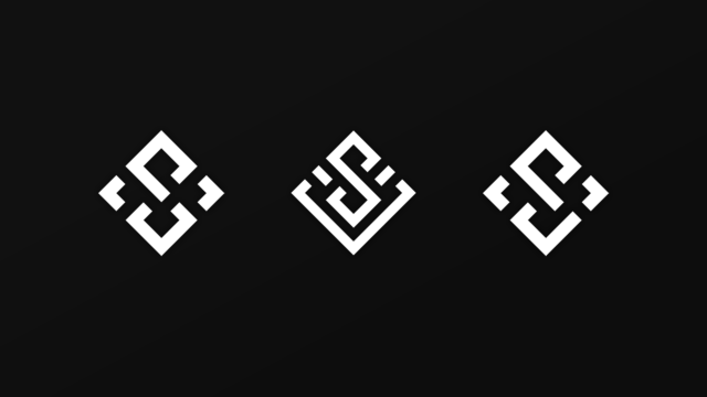
So, this is a diamond logo but for designs sake, I designed it as a square and I’m sure this is pretty common practice.
I designed this out on a notebook with a square grid and so I know that the logo lines are supposed to be the same width as the empty space as well.I used the pen tool to create the lines and made the “shape” transparent fill but the outline a certain pixel width. Now for the hard part, figuring out the distance between everything so it matches up to the grid pattern I designed it around perfectly.
I searched up a method, it suggested the measure tool. I got to work and measured the width of the “shape” and saw that the “D:” field was 12.7. So, I went about using guides to rule out every 12.7 “D” (which i’m assuming stands for distance). Once I had enough guides, the rest of the logo wasn’t too hard to fill in, but the overall process felt tedious and I wondered the entire time if this was a long, round-about way of doing this when something else exists to make life easier.
Anyone able to give me tips as to how /you/ would have designed out this logo (the method itself, not the concept).
Logo copyrighted by StudioVulcan.

Sorry, there were no replies found.